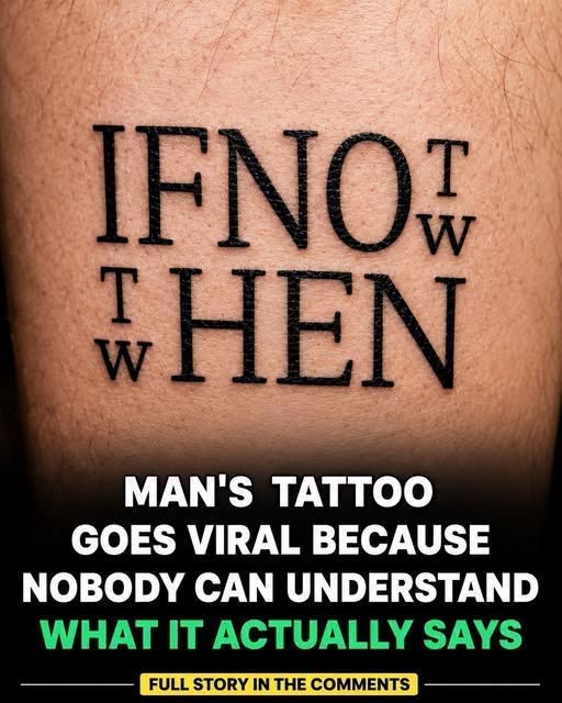
A blurry photo circulating online this week sparked widespread confusion after people struggled to interpret a tattoo on a man’s forearm. What was intended to be a simple motivational quote has instead become a source of debate, with viewers unable to agree on what the ink actually says.
The tattoo was originally meant to display a meaningful phrase in bold lettering running down the arm. However, the design appears densely packed and unevenly spaced, making the text difficult to read. The result is a distorted arrangement of letters that many describe as nearly impossible to decipher at first glance.
As the image spread online, users attempted to interpret it in different ways. Some saw random shapes, while others proposed competing versions of what the text might be. The discussion quickly became fragmented, with no clear consensus emerging.
Over time, however, a widely accepted interpretation surfaced: the phrase “If not now, then when.” Even with this suggested answer, many viewers still find it difficult to visually confirm, as the lettering remains unclear.
The situation highlights how design choices can significantly affect readability. What was intended as a clear motivational message ended up becoming visually confusing, showing how easily meaning can be lost when form and layout are not carefully considered.
Beyond the humor and confusion, the image has prompted broader reflection on miscommunication. Intentions do not always translate clearly into outcomes, and what makes sense to one person may be difficult for others to interpret when presentation gets in the way.
As attention moves on, the tattoo remains an example of how permanent decisions can carry unintended consequences. It also serves as a reminder that clarity of expression—whether visual or verbal—depends as much on execution as it does on intent.